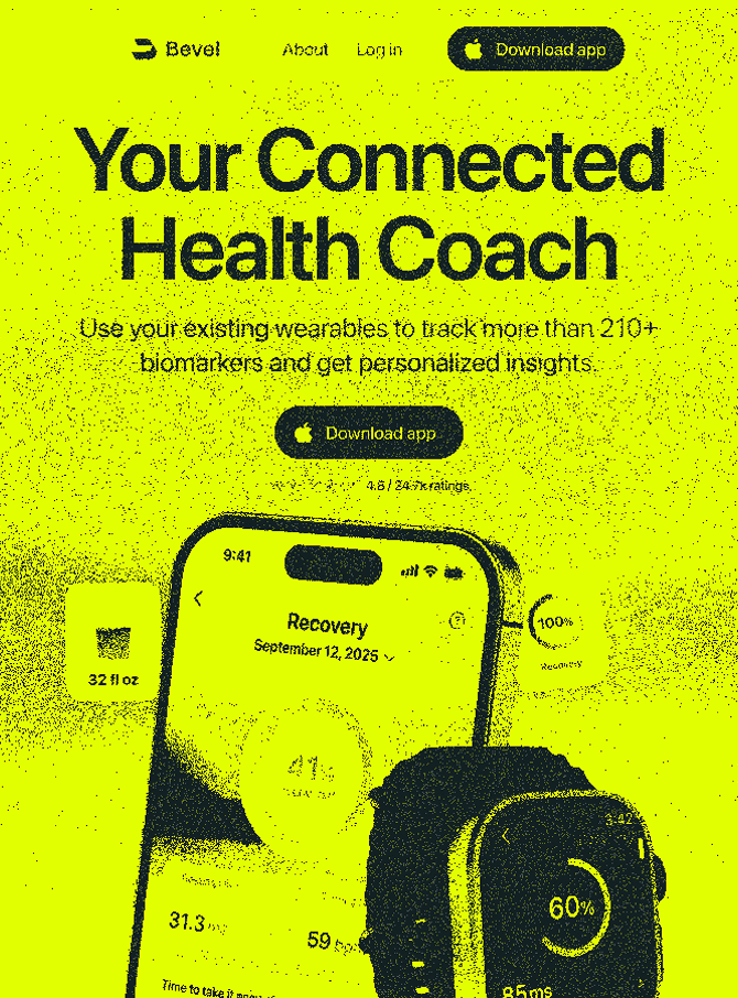
.png)
You Can't Assemble Unmistakable
Almost every discovery call I sit in on includes some version of the same sentence.
The founder tells me they want a brand that no one could confuse with anyone else — one that holds a strong opinion and stands by it, rather than trying to blend in with the crowd.
And then, often in the same conversation, they share a list of sites and brands they've been collecting. There's usually one on that list they keep coming back to, a company that stands head and shoulders above the rest. A company that had a unique vision and was able to easily differentiate themselves from others in their industry because they weren't afraid to take risks and didn't fall for the same trap every other company in their niche fell for.
Because of their strong opinions, they were memorable.
I'm also fairly certain the process that got them there did not include trying to imitate everyone else, or as I like to call it, use mood boards.
To be clear, I used mood boards for years throughout my career. They are fun to pull together and it doesn't take much effort to present a few directions to a client that feels polished and considered. But there's one glaring issue with this approach — you are just assembling borrowed items from existing brands. There is nothing there that will get you where you need to go, at least not if you are trying to differentiate yourself from what everyone else is doing.
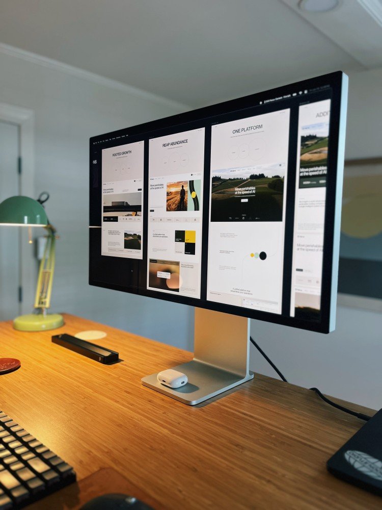
Mood boards are easy to get approval on, because you are simply assembling visuals the client already shared with you and peppering in a few others with a similar aesthetic, adding color and type references, maybe giving it a clever name, and calling it a day. The founder who sees the ideas they've already collected from other brands will happily approve these, because there is nothing new to approve. It's all recycled.
The problem with mood boards is that you are just collecting someone else's ideas. There is no strategy or thought behind choosing one direction over the other — you are dealing in pure visuals without any kind of story, and a unique and clear story is what people actually remember.
Mood boards are uncontroversial and safe, but they don't allow you to develop a brand that has personality, is memorable and dares to draw attention. There is nothing foundational or divisive to discuss, so the option that ruffles the fewest feathers gets selected and everyone moves on.
The problem always shows up later
That missing foundation shows up later, usually at the worst possible time. Because a board doesn't contain an argument, there is nothing in it anyone can actually be wrong about. You look at a bento layout and think it's clean, the client looks at the same grid and thinks it looks premium, while another person on their team notices the photography and never registers the type at all. At the end everyone walks out of the call believing the project is aligned.
The belief is real. The alignment isn't.
That disagreement doesn't go anywhere, it just waits, and it tends to surface weeks into the timeline, in round two of design when there's a hi-fidelity design on the screen and a hard launch date on the calendar, and changing course costs real money and time instead of a quick alignment.
I've been through this more than once. Before we established our framework, we were working with an infrastructure company that had pieces of a brand but no real center to it, and the brand itself was still changing underneath us while we worked.
We went around in circles for weeks. The client kept telling us things weren't clicking and they were right, but nobody in the room could say why, because there was nothing underneath the work to point at.
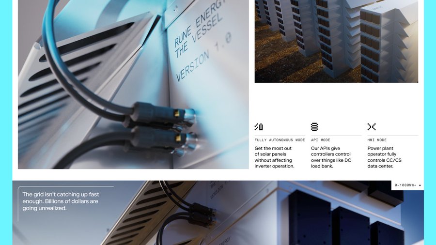
What eventually broke it was going all the way back to the beginning and having a single conversation about how they wanted people to feel when they landed on the site and saw their brand.
We distilled their technology down into a feeling, and once we had that, the design decisions stopped being opinions and started being answers to that singular question. Every single choice stemmed from that reference point, allowing us to quickly finalize the work and go to launch, ultimately reaching the exact audience in the way we intended all along.
Every revision cycle before that conversation was avoidable. That project is the reason we changed how we work.
What we do instead
Instead of using mood boards, we use something we call the Concept Framework. The simplest way to describe it is that we do all of the thinking in words, stories and ideas before anyone even opens Figma.

It starts with research and positioning, which really comes down to five questions we have to answer before we're allowed to get creative about anything.
- What can this company factually claim that its competitors cannot.
- Who is this actually for, and what language do those people use.
- What does the brand and site need to accomplish, whether that's leads or credibility or recruiting or a raise.
- How should someone feel in the first five seconds, named as three to five specific responses.
- And what does the rest of the category look like, which is how we find the room nobody else is standing in.
Out of that we pull themes, using eight to fourteen single words taken from what the client said in their own language and what their materials actually show. These aren't creative decisions and they aren't supposed to be. They're observations, and their entire purpose is to keep everything throughout the project anchored to something that is true about the company and where they want to go.

The language part matters more than it sounds. If the client says jobsite, we don't write workplace. If they say fleet managers, we don't write users. The moment you translate a client's vocabulary into generic industry speak, you've started drifting toward the mean without anyone noticing.
Using the themes as a base, we build three metaphors — a word or a short phrase with a paragraph underneath explaining why it fits. A metaphor is not a headline or a tagline, but what's underneath. It turns an abstract promise into something a person can picture and feel.
Red Bull doesn't sell caffeine, they sell wings. Figma doesn't sell a vector editor, they sell multiplayer capabilities.
Once that anchor exists, it steers the type, color, motion and the copy without anyone having to adjust the direction every week.
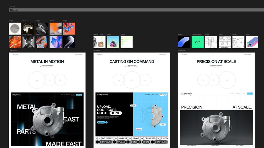
For a metal casting company, one metaphor was Forge. Casting is one of the oldest manufacturing processes around and this company had compressed eight weeks of it into two days, which turned the entire brand into a story about time.
For a freight platform it was Flow, the current that carries a shipment from quote to delivery without friction, in a category full of disconnected tools.

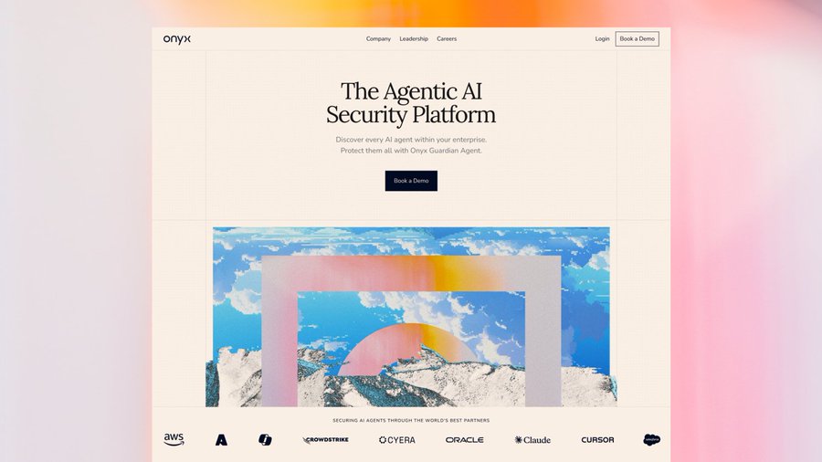
For a security company it was Beacon, because everyone in cybersecurity sells from shadow and fear and there was an obvious opening for light and calm authority.
Those metaphors get combined into three full directions, each leaning into a different mix of them with a headline, a couple of supporting lines and a distinct visual tone. Each direction leans into a different metaphor intentionally. One is the expected read, the confident and familiar choice that carries the least risk. The second is bold, more opinionated and willing to make somebody uncomfortable. The third is the wildcard, usually more conceptual or more systematic, and its job is to reframe the conversation entirely, testing the boundaries of what we all think is possible for the brand.
The client is choosing between three different strategic arguments, not the same idea at three different volumes.

The headlines are written to survive contact with a hero section or brand use case. For the metal casting company, one direction was called Metal in Motion, with the line "Still hot. Already shipped." For an ad platform, it was Uncopyable Energy, with "Be the ad they can't scroll past." You can't get to either of those from a grid of screenshots. They only exist because somebody wrote down what was true about the company first.
There's one test we run on every direction before it goes anywhere near a client. Could you swap the client's name into this and have it still work? If the answer is yes, it isn't a direction yet, it's a template, and we end up pushing it further until it does.

We pair this with original design, not borrowed visuals. The client is responding to a position they can argue with instead of a visual they've already seen elsewhere, which they have to interpret and attempt to reframe into the fuzzy picture they have of what their brand could be. Instead of trying to imagine what their brand could look like, we are able to show them, in clear terms, and back it up with strategic thinking. We ask them which story feels most closely aligned with their brand and would resonate with their audience. When they provide their feedback at this stage, they can tell you exactly why because they can see and understand it, and we're able to quickly adjust before moving into the full design phase.
Building on this approach, we also start every project with a completely blank canvas. We don't start with layouts that seem interesting or scan Siteinspire or Awwwards for the latest trends to inject. We start with the story the brand needs to tell in order to be successful, using the language that most closely resonates with their audience.
You can't find a unique platform if you are trying to stand on everyone else's.
If you were to show them a mood board and tell them to imagine that "it'll be kind of like this, but with your brand colors", it's nearly impossible to imagine. Instead, we show them what their brand could actually look like in just a few days from kickoff.
Instead of asking them to imagine the future of their company, we show them.
They're able to select the direction, strategy and rationale that most closely resonates with the story they are trying to tell the world, and we're able to get straight into hi-fidelity design before the other agencies have even started assembling their bento grids of borrowed items.
The landscape
None of this means we ignore the work that already exists, laterally and within our clients' industries. It all lives inside the competitive audit, where we analyze the landscape and determine where we need the brand to live in order to stand out.
We're asking questions to determine where the empty space and opportunity for the brand is, not what it should look like (at least not yet). Knowing that every company in a category reaches for the same blue and isometric illustrations is useful information, because it tells you what not to do, but the reference simply informs the argument. It never becomes the deliverable, and we never hand it to a client and ask them to pick which one aligns with their own personal preferences, because the goal and final destination requires more than a surface-level scan of what's already built.

What you're actually paying for
If we're being honest about it, this phase is most of what you're paying for when you hire a studio like ours. The design isn't the expensive part, it's the thinking that happens before the design ever starts. It's the system that produces something unique and evocative, that nobody else could have arrived at.
You can't get there by picking from a wall of finished work, because everything on that wall was already the answer to somebody else's question.
What founders actually mean
Every founder wants to be unmistakable. Very few can tell you what they want to be unmistakable for, and that answer is different for every company, which is exactly why it can't come off a board. It's usually sitting a few layers underneath the way they currently describe themselves, and when we finally get down to it, it tends to be a claim their competitors couldn't make without lying.

That's the trap with starting with references of existing work. You can only choose from what has already been made, and the thing you're trying to build is the thing that doesn't exist yet.
So why would you use someone else's story in an attempt to tell your own?
The companies founders keep coming back to didn't find their brand on anyone else's website. They figured out what they believed, spoke it confidently and stood behind it long enough that people noticed and remembered.
It's harder than assembling a bento grid and it takes longer, but it's the only way I know to end up with something that couldn't possibly belong to anyone else.